In the post below, you will find the final edit of my group's production work; a music video for the song "Sorry" by Nothing But Thieves.
Under the labels "Digipak Production" and "Magazine Advert Production", you will be able to final the ancillary tasks I have created in relation to the music video, as part of a package of promotional material for the song we have chosen.
The remainder of my posts are also organised into labels via the sidebar, for ease of navigation of my blog.
I have enjoyed every aspect of the process that contributed to creating our music video, and our final product is something that I am very proud of. I believe that my skills in all areas - research, production and evaluation - have improved considerably over the course of my studies. However, having started my A Level studies with very little production experience, I feel as though my skills in this area have advanced most, especially in terms of cinematography and editing.
Wednesday, 11 April 2018
Monday, 9 April 2018
Final Edit of Our Music Video
Here is the final edit of our music video:
I am extremely pleased with the completed version of our music video, and I believe the quality is demonstrative of all the hard work that was carried out by the group. Despite experiencing problems and set-backs throughout our production process, I think that our final product highlights that we were able to combat the issues we faced effectively. Our ability to work efficiently and creatively as a team is evidenced by this piece, via the range of cinematography and editing techniques that are included.
Friday, 6 April 2018
Evaluation Question 4
How did you use media technologies in the construction and research, planning and evaluation stages?
In addition to the technologies specified in the presentation above, we also used other media technologies during the construction process of our music video.
iPads: At the very beginning of the year, our school had just invested in some iPads and iPad tripods. Due to the very poor quality of our school cameras, we decided that we would attempt to use an iPad to film our music video. On the first day of filming, we took the iPad and used this as our method of recording. However, on reflection of the footage, we realised that the shots were not very good quality. We could see that in shots that were not brightly lit (very little of our music video was planned to be filmed in bright locations), the footage appeared grainy. This diminished the professional feel of our video, and therefore, we wanted to find another method to film.
Mobile Phones: After trialling the iPad for filming, and realising the it did not allow for good quality footage, we decided that we would attempt to film on our mobile phones. We carried out a direct comparison between the footage of the iPad and the footage of the mobile phone, and we could see that the mobile phone footage was much clearer. We then made the decision to film the rest of our music video on our mobile phones, as we did not have access to a DSLR camera, or similar. We found this to be a convenient use of equipment as we always carry our mobile phones, which meant that we did not have to worry about picking up extra filming equipment. The only problem we encountered using mobile phones was that when filming constantly, the batteries begin to run low very quickly. To combat this problem, we made sure to always carry a charger for our devices, and to carry a portable charging bank, too.
Thursday, 5 April 2018
Evaluation Question 3
What have you learnt from your audience feedback?
Throughout the process of this project, we have received audience feedback in many areas; our storyboards, our edits and our ancillary tasks. Audience feedback is vital in the creative process, as it allows you to develop the final product to be more suited to want the audience want, hence making your project better and more appealing.
Media Showcase Evening...
The Media Studies department held a 'Media Showcase Evening' on the 15th of March, in which they invited friends and family of students along to show them the work that the students have been producing throughout the year. We took the opportunity of having our piece showcased in this event to obtain some audience feedback for the final draft of our product.


Audience feedback throughout the project...
Throughout the course of the project we received feedback that was vital to the development of our products; our music video, the digipaks we created and the magazine adverts we created.
For us to gain this feedback, we reached out to the Media Department staff, as well as individuals of both genders aged 16 to 20. It was imperative that we gained feedback from individuals in our target audience, as they could tell us exactly what they liked and disliked about the piece. They made suggestions for improvements based on these things, and we also brainstormed ideas based on their likes and dislikes about the piece. These were particularly important as we needed to know what we could do to enhance the viewing experience of the target audience, to make them really engage with and enjoy the piece.
Here is a table outlining some of the audience feedback we received on different pieces throughout the project, and what we did in response to those comments:


Throughout the process of this project, we have received audience feedback in many areas; our storyboards, our edits and our ancillary tasks. Audience feedback is vital in the creative process, as it allows you to develop the final product to be more suited to want the audience want, hence making your project better and more appealing.
Media Showcase Evening...
The Media Studies department held a 'Media Showcase Evening' on the 15th of March, in which they invited friends and family of students along to show them the work that the students have been producing throughout the year. We took the opportunity of having our piece showcased in this event to obtain some audience feedback for the final draft of our product.

The showcase not only provided us an opportunity to show our music video, but we also got the opportunity to show our ancillary tasks. In the picture below, you can see some of the red boards that we used to display our digipaks and magazine adverts.

As people were viewing my ancillary products, I took the opportunity to ask them some questions to gain some audience feedback on the final draft of my digipak and magazine advert.
- "It is evident that you have good skills in using Photoshop, as the pieces you have created could be mistaken for professional pieces"
- "The consistency of images, typography and colour throughout your creations demonstrate that they are all part of a promotional package for the same thing"
- "The selection of images you have used is particularly effective. I like that you have used a frame from the opening shot of the music video on both the digipak and the magazine advert. I think this establishes continuity throughout the pieces, making them recognisable"
It is evident to me from the feedback that I received that my products are successful in their purpose to promote the song, in conjunction with the music video. I liked that people were able to draw on the consistency of the imagery that I have used throughout the tasks, as this suggests that the promotional package I have created for the song is recognisable. The feedback I received also made note of the Photoshop skills I had had to employ to create the products, which suggests that I carried this out well. From this feedback, I believe that overall, my ancillary tasks are successful in their purpose.
After all of the pieces had been shown, we asked members of the audience if they would be willing to answer some questions for our group, so that we could gain audience feedback. I produced a video of of the answers we received in relation to the four questions that we asked the individual:
After reviewing the footage of the feedback we received on our music video, we were able to draw these conclusions:
- The audience thought that our song choice, and the narrative we chose, fitted together well. They thought that the lyrics of the song helped contribute and tell the narrative, and that the narrative of the video helped to shape the meaning of the lyrics.
- The audience enjoyed that our narrative focused around LGBT relationships, as they thought that our video provided important representation of a community who still face prejudice in today's society. The transition between black and white and coloured shots was effective in demonstrating how the mood of the piece changes, reflective of how the protagonist feels.
- The audience were not able to easily identify if Hannah and Jade's characters actually got into a relationship at the end of the video. There was confusion as to whether the sequence demonstrated a really good friendship, or whether it showed that their relationship had moved on from platonic to romantic. This lack of understanding highlights that we were not quite entirely successful in portraying the narrative of our piece. The audience suggested that in order to make the relationship more clear, the final sequence of footage should have included shots in which the characters were seen to be more intimate, as this would have made the relationship explicitly obvious.
- The audience perceived our target audience to be broader than we had identified, though they did identify our target audience within their estimates. At the beginning of the project, we specified that our target audience would people age 16-20 of both genders. The feedback we received in the video does successfully identify that our target audience was predominantly younger generations. We had not thought about specifying our target audience in terms of sexuality, though our audience said that the piece would be suitable for viewing by both straight and LGBT individuals. The audience thought that the message we portray in our video is important to be seen by everyone, as diversity in our society should be encouraged. It was raised that the theme of same sex relationships in our music video makes the piece important to show younger generations, to encourage people to embrace who they are from early on in their lives.
That night, there were awards up for grabs, that were voted for by the audience. We were awarded 'Best Cinematography' as we received the most votes for this category. This form of feedback shows us that the audience thought that our music video was the most visually and aesthetically pleasing, and that the camera handling/work was the best out of the other productions that were showcased that evening.
 |
| This is the award we received for 'Best Cinematography' |
Throughout the course of the project we received feedback that was vital to the development of our products; our music video, the digipaks we created and the magazine adverts we created.
For us to gain this feedback, we reached out to the Media Department staff, as well as individuals of both genders aged 16 to 20. It was imperative that we gained feedback from individuals in our target audience, as they could tell us exactly what they liked and disliked about the piece. They made suggestions for improvements based on these things, and we also brainstormed ideas based on their likes and dislikes about the piece. These were particularly important as we needed to know what we could do to enhance the viewing experience of the target audience, to make them really engage with and enjoy the piece.
Here is a table outlining some of the audience feedback we received on different pieces throughout the project, and what we did in response to those comments:


Tuesday, 3 April 2018
Evaluation Question 2
How effective is the combination of your main product and ancillary texts?
When creating my music video, digipak and magazine advert, I was aware that their purpose was to act as promotional material to promote the artist and the song. This meant that the products should be recognisable as promotional material for the same product, by incorporating similar images, themes and colours. Below are the three media texts that I created:
My video:
This music video was created by my group, of which we all had an input on the ideas and the final outcome.


Official typography:
 The use of typography in creating recognisable branding of an artist is vitally important. I chose to use a font very similar to that used in the official promotional material for this song. I chose to do this as the font they have used is obviously suitable for promoting the alternative genre of music. Therefore, I decided to use a style similar, to ensure that the typography of my piece would also be suitable for the genre of music. Additionally, when deciding on the font, I had to make sure that it gave a nice overall effect on the piece. When choosing the colour of the texts in the titles of the music video, I had to make sure that it was easily readable on the background of which it was placed.
As I added the titles to the the music video via a video editing app, the font I used was not available for me to use on my other media texts. I searched through the fonts available of Photoshop, which was the platform I used to create my ancillary tasks. Therefore, I had to search through the fonts to find the one that was most similar to the one I had used in the music video. I eventually found one that I thought would be suitable, and as is demonstrated in the grid, the fonts are very similar. Much like in the official promotion material, I made sure to make sure that my text was all in capital letters.
A difference between the typography of the ancillary tasks, and that of the music video, is that I included a line between the name of the artist and the name of the album on the ancillary tasks. When creating the titles for the music video, we did not have the option to add in a line between the names with the editing app that we used. However, I do not think it would have fitted particularly well even if we had had the ability to include it. I chose to use a line between the artist name and the album name on the ancillary tasks, as I believe that this helped you to visually separate the text. It made it stand out more, as encouraged you to read the names separately, making it easier to take in the information. I thought this was particularly useful for marketing purposes.

The combination of my ancillary tasks can be seen visually on my magazine advert. It features an image of the front cover of my digipak, which would be the front cover of the album. Through including this, it not only conforms to conventions of magazine adverts, but it also demonstrates the effective synergy across these two tasks. It is evident that the use of the same image is effective, but also, it demonstrates that there is an effective and slick colour scheme used throughout the two pieces.


When conducting research into the codes and conventions of album covers/digipaks and magazine adverts, I found that it was common for them to include relevant social media or web links in relation to the artist. Due to this, I decided that it was necessary for me to include them in my ancillary tasks, to make sure they conformed to conventions appropriately. As demonstrated in the table above, I made sure that the web address I included was the same in each, as in official products, this would be necessary. I chose not to include social media links, and only the web URL on the digipak, as I felt that the back panel would become too cluttered if I were to add other social media information. Additionally, the customer would be able to access the social media platforms of the artist via their website. I chose to include the social media handles on the magazine advert, however, due to the nature of the advert. If an individual is reading a magazine, it is likely that at that moment they have time to go onto their phone and visit the chosen social media platform they wish, at the very moment they are reading it.
When creating my music video, digipak and magazine advert, I was aware that their purpose was to act as promotional material to promote the artist and the song. This meant that the products should be recognisable as promotional material for the same product, by incorporating similar images, themes and colours. Below are the three media texts that I created:
My video:
This music video was created by my group, of which we all had an input on the ideas and the final outcome.
My digipak 9with demonstration of functionality):


The digipak was created by myself individually, which means that all ideas incorporated are that of my own.
My magazine advert (with demonstration of functionality):


The magazine advert was created by myself as an individual, which means that all ideas incorporated are that of my own.
How effective is the combination of the pieces?
Throughout these pieces, I made sure to include imagery that was consistent across the three media texts.

The opening shot of the music video is a canted long shot of Hannah walking towards the sea. It is the first thing that people see when they watch the music video, and seeing it immediately means that it is the most recognisable shot within the video. I chose to use this shot on the front cover of my digipak and on my magazine advert, too. Using the same image across all 3 media texts meant that they were all recognisable as promotion for the same song. To people seeing them, they can visually tell that the promotional material is linked. The consistency of image and colour use across the music video, digipak and magazine advert gives a sleek appearance to the package, and therefore, it gives it a professional feel. The predominantly blue, white and black colours I have used across the three pieces reflect the protagonists loneliness, but they simultaneously create quite a calming effect. The image I chose also left ample room for me to include text over it, without the text and typography being disturbed by the subject of the image.

Official typography:

As I added the titles to the the music video via a video editing app, the font I used was not available for me to use on my other media texts. I searched through the fonts available of Photoshop, which was the platform I used to create my ancillary tasks. Therefore, I had to search through the fonts to find the one that was most similar to the one I had used in the music video. I eventually found one that I thought would be suitable, and as is demonstrated in the grid, the fonts are very similar. Much like in the official promotion material, I made sure to make sure that my text was all in capital letters.
A difference between the typography of the ancillary tasks, and that of the music video, is that I included a line between the name of the artist and the name of the album on the ancillary tasks. When creating the titles for the music video, we did not have the option to add in a line between the names with the editing app that we used. However, I do not think it would have fitted particularly well even if we had had the ability to include it. I chose to use a line between the artist name and the album name on the ancillary tasks, as I believe that this helped you to visually separate the text. It made it stand out more, as encouraged you to read the names separately, making it easier to take in the information. I thought this was particularly useful for marketing purposes.

The combination of my ancillary tasks can be seen visually on my magazine advert. It features an image of the front cover of my digipak, which would be the front cover of the album. Through including this, it not only conforms to conventions of magazine adverts, but it also demonstrates the effective synergy across these two tasks. It is evident that the use of the same image is effective, but also, it demonstrates that there is an effective and slick colour scheme used throughout the two pieces.

In the music video, we introduce colour after the turning point in the video, in which equilibrium is established again; following the final step of Todorov's narrative theory of equilibrium, disequilibrium, to have equilibrium re-established. This is a key element in the video, as our focus on bright and colourful lights act as a reflection of the focus of the video being the LGBT+ community, and the theme relating to sexuality. I thought it was necessary to include images from this section on my digipak, to make sure that the digipak represents the two sides of the video. Subsequently, including the bright and colourful images, alongside the more melancholy coloured shots, highlights the two different emotional states of the protagonist within the video. This combination of the music video and digipak is effective, as if someone was to watch the music video first, then buy the album, they would understand the story that it is telling. Alternatively, if someone were to buy the digipak first, before watching the music video, it would intrigue them to want to watch the video. They would want to find out more about the stark difference in colour, which would draw them to seek to watch the music video, which would create more viewings, and therefore, more marketing, too.

When conducting research into the codes and conventions of album covers/digipaks and magazine adverts, I found that it was common for them to include relevant social media or web links in relation to the artist. Due to this, I decided that it was necessary for me to include them in my ancillary tasks, to make sure they conformed to conventions appropriately. As demonstrated in the table above, I made sure that the web address I included was the same in each, as in official products, this would be necessary. I chose not to include social media links, and only the web URL on the digipak, as I felt that the back panel would become too cluttered if I were to add other social media information. Additionally, the customer would be able to access the social media platforms of the artist via their website. I chose to include the social media handles on the magazine advert, however, due to the nature of the advert. If an individual is reading a magazine, it is likely that at that moment they have time to go onto their phone and visit the chosen social media platform they wish, at the very moment they are reading it.
Monday, 2 April 2018
Evaluation Question 1
In what ways does your media product use, develop or challenge conventions of real media products?
Here is a video that the other three members of my group filmed in which they discuss the ways that our music video uses, develops and challenges forms and conventions of real media products:
Here is a video that the other three members of my group filmed in which they discuss the ways that our music video uses, develops and challenges forms and conventions of real media products:
Unfortunately, I was unable to make this meeting with my group, as I had other commitments with another one of my A Level subjects. However, in response to this video, I have created this PowerPoint that I have uploaded onto SlideShare which details my views on how the media product we created uses, develops or challenges conventions of real media:
Wednesday, 28 March 2018
Goodwin's Theories: Our Video
After carrying out research into Andrew Goodwin's theories at the beginning of this process, we kept them in mind throughout the completion of our music video. We thought that it would be valuable to reflect on the ways that our video does/does not conform to Goodwin's theories post the completion of the final draft of our video. Unfortunately, Caitlin was unable to attend on this day to contribute to the discussion.
In our music video, we used Goodwin's concepts of illustration and amplification, and we did not touch upon the concept of disjuncture.
After filming this video, I realised that we had only touched upon one area of Goodwin's theory; whether the lyrics of the song matched the visuals of our music video. We had, in fact, not discussed genre conventions, the visuals matching the music, star representation and voyeurism/'the notion of looking'.
Genre conventions: I believe our video conformed to Goodwin's theory of genre conventions partly, as there are many indie/alternative music videos that are narrative music videos. An example of this is the music video for "If They Only Knew" by Alfie Arcuri:
However, we did not include lip syncing in our video, which are common features in music videos of the indie genre. We decided that we did not want to include lip syncing, as we wanted to focus more heavily on the narrative of our piece. Due to us tackling the topical issue of LGBT+ relationships in our narrative, we wanted the video to solely focus on this, to highlight its importance. We felt that including lip syncing would be including it when it was not necessary, and we felt as though it would not add any value to our video.
Visuals matching the music: I believe our video did conform to this element of Goodwin's theory, as I believe that the visuals of our music video did match the music. Particularly towards the end of the piece, beginning most prominently during the argument scene, the shots in our music video are fitting to the chosen song. In the argument scene, Hannah intentionally lined up the footage where her arms rise, to coincide with the lyric "maybe". Additionally, in the montage of the shots of Jade and Hannah, it was closely edited to make sure that the shots transitioned on the beat of the song. We also managed to subtly line up movements of the characters heads and eyes to comply with the beat/rhythm of the song. We focused more on this in the second half of the video, as it helped with the build up of the narrative, as it added more of an impact to the section due to it being more pleasing to the senses of the viewer.
Star representation: We did not conform to Goodwin's theory of star representation, as we did not have a celebrity/well-known individual in our music video. It was not featured in our video in any way; not through costume, movements or appearances.
Voyeurism/'The notion of looking": I do not believe our music video includes any voyeuristic treatment/objectification of women, so it does not conform to this aspect. Voyeurism would have had no contribution to the narrative of our video, and therefore, it was unnecessary for us to use this. Additionally, as it was a piece created for school, we did not feel voyeuristic features would be appropriate.
However, our piece does conform to "the notion of looking", as we include multiple shots of Hannah looking at herself in the mirror. The mirrors, and filming the protagonists in them, are representative of the notion of looking.
Sunday, 25 March 2018
Changes to Our Plans
Throughout the production process, there were a number of our original plans that we had to change, for a variety of reasons. In this post, I will outline the changes that were made, with justification as to why. I will also make comments in reference to our contingency plan.
The Boyfriend
At the beginning of the production process, it was planned that Rhys Jones would play the role of the boyfriend of the protagonist in our music video. However, before we started filming, Rhys broke his leg, which meant he was no longer able to be featured. As a result, we had to find another person suitable for the role, and we picked Josh East. Thankfully, this incident happened before we had begun filming, as this meant that we had not wasted time collecting footage that we would be unable to use. Instead, the whole process would start as it was meant to, but just with Josh taking Rhys' place in our cast.
The Song
During the editing process, we discovered that the footage we had filmed was not very suiting to the song that we had initially chosen, which was 'W.D.Y.W.F.M?' by The Neighbourhood. Due to a lack of resources, equipment and budget, we were unable to create the correct aesthetic that we wanted to achieve for the piece, to fit with that song. This forced us to go back to the drawing board, as we knew that if we stuck with our original song, then our final piece would not be of a good standard, and our group would feel unsatisfied. We needed to find a new song that fitted with our original narrative, was of the 'alternative' genre, and that would go with the footage that we had already collected. After consideration and exploration, we identified that 'Sorry' by Nothing But Thieves would be perfect, as it did all of those things.
Narrative
Changing the song that we were going to use for our music video meant that we would need to alter the way in which we would portray the narrative, and also alter the narrative very slightly. Our original plan was that Hannah's character, the protagonist, would not actually get into a relationship with her best friend (the one she falls in love with). However, with the change of the song, such a heavy focus on the protagonist's emotional trauma did not feel fitting. As a result, we decided that we would change the ending of our piece to include the build up of the two female characters actually getting into a relationship. We thought that this more positive ending fitted better with our new song, and we wanted the narrative to follow similar to that of Todorov's narrative theory; equilibrium, disequilibrium, then return to equilibrium. We also thought that this would give a more optimistic message for the LGBT+ community, as it demonstrates that self-acceptance and embracing who you are is a positive thing. It also provides important representation of the LGBT+ community, which is important considering there remains a societal taboo, and prejudices, around this. It highlights how someone can be negatively affected by feeling that they have to hide who they, and feeling scared to express themselves, because of these remaining societal issues.
Changing the narrative, though only slightly, meant that it was necessary for us to think of new filming locations for the shots that we wanted to achieve. We decided that in order to effectively portray the contrast of the unhappiness that Hannah's character felt with her boyfriend, compared to the happiness that she experiences with Jade's character, that we needed to show a direct comparison. In order to do this we mostly chose locations to film that were the same, or similar to those that we filmed with Josh. This would allow us to replicate shots, but with Hannah looking happier with Jade, allowing the audience to draw a direct comparison. Here is an outline of some of the filming that we needed to complete after making this change:

Props
After we changed the song for our music video, we did have to alter some plans in terms of the narrative. This had an affect on the props that we would be using. With our initial song choice, we had the need to use cigarettes and fake drugs as props, to emphasise the mental trauma. However, we did not feel that the tempo of the new song we had chosen called for these props to be used anymore. We decided that shots of alcohol and drinking could reflect themes of emotional trauma and declining mental health due to self-conflict efficiently.
Filming Schedule
We were unable to adhere to our initial filming schedule for a variety of reasons, meaning our contingency plan had to come into place here. With rota's for our group members jobs being released sometimes only days before their shifts, we were forced to have to reschedule a lot of our filming sessions. This meant that the date we would complete filming got pushed further back than we would have liked.
One of the members of our group moved house during our production process, which meant they were largely unavailable for filming for a period of time. As this individual played the protagonist in our piece, we could not film without them, which added a further delay to our filming. This was unable to be fixed with a method similar to one in our contingency plan, as there was no solution. We could not film without Hannah, and therefore, we had to try our very best to make ourselves free whenever she had a little period of availability, to try and get us back on schedule.
Though we did not finish filming for our piece until a later date than we had initially planned, we were still able to start our edit with the footage we had already obtained. This meant that we did not fall behind that much in terms of our project timeline.
The weather did have an affect on our filming, mostly having an impact on filming that we needed to complete at the beach. When considering weather, we had not considered that high levels of coastal wind would make filming difficult. However, when we made the first trip to the beach to attempt to film with Jade and Hannah, the wind was so strong that we were unable to film certain shots that we had planned, due to their hair blowing in the wrong directions. To try to combat this, we filmed all the footage we could on this occasion, and scheduled to return to the beach on a less blustery day. We returned to the beach a few days later, as there did not seem to be much of a breeze that day. However, the wind was strong when we had reached the coast, so we were faced with the same issue. This meant that we had to improvise in terms of shot ideas, and how we could create the same affect, by using different shots. In my role as director, I instructed these changes, and attempted to find ways that we could still gather shots to shape our narrative, that did not show how windy the weather conditions were, as this would have looked unprofessional.
Editing Software
As I have outlined in my posts based on editing, we were forced to switch editing software after we had begun editing, due to regulation problems stopping us fro being able to attend the location in which we were using their facilities. We had to switch from Adobe Premier Pro, to iMovie, which although meant regressing in terms of the complexity of the software, it meant that we were able to use it more easily. Subsequently, we believe that having to alter the editing software we were using was very beneficial to us as a group, as it allowed us to make full use of the features available to us on software that was easier to navigate.
Friday, 23 March 2018
Magazine Advert Functionality
Using Photoshop, I used a template of a magazine I found online, in order to assess the functionality of the magazine advert I created. Here is a mock-up version of how the magazine advert I created would look if it were actually to be featured in a magazine:

I searched for a simple online template, as I did when I was looking to asses the functionality of the digipak that I created for the album, so I could Photoshop the magazine advert I created over the top of it. Fitting with my creation of the mock-up piece for my digipak, to create this piece for my magazine advert I had to use the transformation tool to re-size and rotate the image so that it was the correct size and angle to fit onto the magazine template. I also had to use the warp tool again, so that the advert effectively fit onto the template, and gave the impression that it was part of the magazine. As I had experience in using the warp tool at this point, I found that I could carry out this technique more easily this time.
Overall, I am very pleased with my magazine advert and I believe that it is for purpose. I like way I have chosen to position the main image, so that it frames the information I have layered on top of the image to effectively draw attention to it. I particularly like my use of the black coloured header and footer, as I believe these help to make the information I have included on the advert more clear, and that they help to segment it appropriately so that it does not appear cluttered. I think that the magazine advert comes together with the digipak and the music video to create a sleek and effective promotional package for the album; the typography I have used in the digipak and the magazine advert is consistent, and the image I have used in the magazine advert is the same as that used on the front cover of digipak, and this is taken from the opening shot of the music video my group created.
Monday, 19 March 2018
Magazine Advert Final Draft
Here is the final draft of my magazine advert:

What has changed since the draft?
Once I had created the draft version of my magazine advert, I received feedback on it from my teacher and from my peers; I also critically reviewed the piece I had created myself. I took this information and altered the design to created my final draft, which is pictured above.
I decided that the album and artist name needed to be prominent, and therefore, I attempted to make them more bold. To do this, I duplicated the title layer, and moved the layer very slightly out of line with the original. This created a bold effect, which I think will help to draw more attention to this particular area of the advert.
A change that I made to a few areas of the magazine advert was suggested by my teacher; she thought I should make certain elements of the text bold, to help to signify their importance. I took this advice on board and I chose to bold the following words/phrases: "out now", "Sorry" and "Amsterdam". I chose to bold the phrase "out now", as this is key information for the target audience. They need to know that the album is available for them to purchase at the time they are reading the advertisement. I chose to put the name of the singles "Sorry" and "Amsterdam" in bold, too. I did this as, although I increased the font size of them, I thought that changing the font to bold would help to draw attention to them further. It is important to draw attention to these names for reasons I outlined in my post about the draft of my magazine advert.
When reviewing my magazine advert draft, I felt that the small image of the album cover needed to stand out more. Therefore, when creating my final draft I attempted to make this happen. I created a white square that was just a little bigger than the album cover image size, which helped to differentiate it from the black cover of the footer. To make it stand out more, I went into the layer options, and selected multiple blending options; 'contour', 'outer shadow' and 'bevel and emboss'. I thought these tools were effective in helping the album cover image stand out even further off the white square that I had created, as they helped to create the effect that the image was raised from the other layers.
One of my peers mentioned how I should also include the social media handles of the band, as this will provide ease to the investigate the artist. This is a convention that is commonly featured in magazine advert promoting albums that I had previously overlooked, so I decided that I should include this in my draft. I decided to include the Twitter and Facebook handles of the artist on the advert, as these are two of the most used social media platforms.
Tuesday, 13 March 2018
Magazine Advert Draft
Here is the draft of my magazine advert that I created:

Much like my digipak did, my magazine advert both coincides with and differs from my original plan.
The image I have used is the one that I outlined in my plan for my magazine advert. I decided to use the image that is on the front cover of the digipak, as this links the two pieces together very well. It is also part of the opening shot of the promotional music video we created, which ties the promotional package together nicely. Instead of centring the image like on the digipak, I positioned the image so that Hannah was to the right-hand side of the frame. I did this so that I could add text in the 'empty' space of the image, so that it would not get lost over the top of Hannah. I thought that this positioning of the image also helped to draw attention to the text layered on top of the image because it acted as a frame.
 A key difference between my original plan and my draft, is that in the draft I have used two black shapes that act as a header and a footer to the poster. I took inspiration from the magazine adverts for Mumford & Sons album 'Sigh No More', of which most of which the image(s) were the focal point of the centre of the advert [featured to the left]. The album and artist names were featured in a black coloured strip/space above this, and other information was featured in the equivalent below the image(s). I thought this would be effective to use on my magazine advert, as I had found that the text had been disappearing into the image, which meant that it could not easily be read.
I kept the album title and artist name the same as on the album cover, in order to make sure that the promotional material included all of the same typography to make the package sleek. However, the text needed to be visible on the black layer, so I had to change to colour of the font to white.
On the plan, I said that I would include the phrase "out now" layered on top of the main image, and that I would outline this with a box. When I was creating the draft of my digipak, I realised that simply saying the phrase "out now" would not be effective, as I had not specified what it was that was being released. Therefore, I chose to include the word "album" in this phrase to make this clear. I did out line the phrase with a box, as I thought that this was a useful tool to draw the eye to this piece of information.
I chose to include the phrase "12 new songs" as the purpose of this piece is to attract people to buy the album. This information is a tool used to draw interest of the target market by multiple artists in the existing magazine adverts that I have viewed. I did not include this in my original plan, as it was not something I had noted well as a convention of magazine adverts for albums at the point of creating the plan. However, once I discovered this was a common convention, I felt it was necessary to use this in my piece.
Fitting with what I outlined in my magazine advert plan, I said that I would include the information about the singles that were included on the album. This is a useful tool for promotion, as the target market (and possibly people outside of this, too) may have heard the most popular singles that were released prior to the album. If individuals liked these tracks, they would be inclined to purchase the album. However, if an individual has not previously heard the tracks, this provides them with the knowledge to research the songs if they so wish to, before deciding whether they will purchase the album. Also in-line with what I planned, I have made the text size for the names of the singles slightly larger than the rest of the sentence as this highlights them as the important information, and will increase the likelihood that people will focus on them.
I included the common conventions of a small image of the actual album cover, and of a web address, as I had outlined in my plan. The small image of the album cover allows it to be identifiable to the potential buyer, and the web address allows for individuals to find out more information on the band, and to find out their social media information, etc. I felt that both elements were getting lost in the main image, so when I added the footer, I felt that this allowed them to stand out more which was essential for them to be effective.
I had originally planned to include information about how the album was available to be bought over the main image of the text. However, when creating the draft, I discovered that this information would have made the main image too cluttered. Therefore, I chose to still include the information, but I would do so on the footer of the advert.
Adding the footer also allowed me to include some extra information, without the advert appearing too cluttered. There was plenty of space for me to include some album reviews, which were a convention of magazine adverts that I discovered that I failed to include in my original plan. Positive album reviews by respected music magazines are important promotional techniques, as they reassure the target market that this is a good product, and that buying it will be beneficial to them. Using the star rating system also provides an easily interpreted review/rating of the album, without having to have to read any information. This is suitable for magazine adverts, as the star icons will draw the reader of the magazine to reviews, and when the ratings are high and are presented clearly, the reader will be more inclined to pay attention to the advert. Subsequently, the reader will be more likely to consider the album, and considered purchasing it.
Friday, 9 March 2018
Magazine Advert Planning
Below is a labelled drawing of the original plan I created for my magazine advert:


Tuesday, 6 March 2018
Functionality of Digipak
Using Photoshop, I used a template I found of a digipak online, in order to see what my digipak would look like if it were to be sold. Here is the version I created in order to assess the functionality of my digipak:

I found a template of a digipak online that I thought would be relatively simple to be able to use to manipulate my design over it to create a mock-up version of it. I used the selection tool to individually cut out each panel of the digipak that I needed to include, and then chose to duplicate the layer into the document with the image of the digipak template. I used the transformation tool to re-size and rotate the the panel to fit the size of the panels on the template. I then used the warp tool to manipulate the panel layers to fit onto the template. I found this to be a tricky task, and had to practice this technique multiple times on the first panel that I edited, until I found that I could perform this action effectively.
Overall, I am very pleased with my digipak and I think that it is fit for purpose. I like the contrasting moods created on the outside and inside of the digipak, and I think that the contrasting use of colours makes its appearance very interesting to the eye. I think that I have demonstrated my ability to use Photoshop well, and I particularly like the layering and opacity I have used on the panel that focuses on Hannah and Josh, and I like the effect created by blurring out the background of the Winter Wonderland panels. I believe I have included all the essential conventions of a digipak, which means that my product would be functional.
Saturday, 3 March 2018
Digipak Final Draft
Here is the final draft of my digipak:


What has changed since the draft?
After reviewing the draft myself, and receiving feedback, I altered it and created the final draft that can be seen above.
When looking at the draft of my digipak, I thought that the images on the outside were not very defined, and I thought they looked quite washed out. To improve this, I increased the contrast across the whole digipak, which make the darker colours more defined, and gave the digipak a better look overall. Increasing the contrast, also made the colour in the Winter Wonderland images pop, and made them a lot more eye-catching.
When comparing the digipak I had created to the existing, official digipak for this album, I saw that they had included a parental advisory label. This is an important convention of digipaks, and one that I had overlooked when planning and creating my draft. Therefore, I decided to include one in the bottom right-hand corner of the front cover of my final draft.
When I received feedback on the the first draft of my digipak, my classmates pointed out two things that I had not included on my first draft. The first thing that was brought to my attention, was that I had not included any sort of social media names/website links on the digipak anywhere. I decided that I would include this on the back cover, as this was where most of the detail was included. I thought that, as this was where people would expect most text, this would mean that the link would be most likely to be read. I decided to include the URL of a website on the back cover, rather than any social media links, as people would be able to access the social media of the band via the website. The other convention that I had not included in my first draft were the icons/logos of the record label. To find out this information, I reviewed the official digipak of the album, and then searched for the logos online so that I could include them.
On the spine of the digipak, I had included the the artist name and the album name. However, on review, I did not like the way I had presented this. Upon looking at already existing digipaks, I found that though they included the names of the album and artist, they did not include 'by' in between them. I chose to remove this, however, I needed to find a way to differentiate the album name and the artist name. I did not want to alter the font/typography used that is a common feature on digipaks, so I chose to use the technique I had used on the cover to do the same thing. I used a thin straight black line to separate them, which maintained the typography features throughout the cover, which made it a lot more sleek.
Feedback that I received from my teacher outlined how the relationship between Josh and Hannah's characters is not particularly obvious from the image that I have included. I agreed with what was said when I reviewed my piece, though I wanted to keep the image that I had initially included, so I decided I would use layering to add another image. To make the relationship more clear, I used the magic wand tool to cut out Josh and Hannah's arms and hands from the close up shot of them holding hands, as I thought this made the relationship obvious to anyone who was viewing the digipak. I positioned the layer in the 'empty' space of the image, and altered the opacity of the layer. This made sure that it did not take the focus of the piece entirely off the original image, and as it blended into the image quite well, it simply just enhanced the narrative. I thought the positioning and opacity of the layer I added, made this panel of the digipak very visually impressive, particularly because the colours of the layer I added, blended with those in the original image.
I kept both the left-hand and right-hand panels of the inside of the digipak the same as on the draft, as I thought these images were effective, which was confirmed to me with the feedback I received. I also kept the centre panel the same apart from one element. My teacher pointed out that I had not included any copyright information on the CD itself. Upon reviewing existing digipaks, I found that this is a common convention, and so I made sure to include it in my final draft. In order to make the copyright information fit well on the CD, I made sure to transform the text, so that it curved around in the shape of the CD.
Wednesday, 28 February 2018
Digipak Draft
Here is the draft version of my digipak that I created:

The 3 panels that will form the outer-side of my digipak are all fitting with my plan, as I have included the images that I said that I would. On the front cover, I have included the artist name and the album title, which fits with conventions of a digipak. I have made sure to centre Hannah in the middle of the frame, as this signifies her importance, and it draws your eye to focus on her. I have made sure that the artist name is bigger than that of the name of the album, as the artist is the selling point. It is important to make sure that this is the most prominent feature, so that the eye is drawn to it. Different to my original plan, I have separated the artist and album name's by using a thin black line. I liked the use of the line on Eminem's cover for his album 'Brainless' underneath the artist and album name, however, I thought I would use it to separate both of those things as I thought that it helped you to differentiate clearly between the two names. I selected a colour from a section of the sky in the image on the front of the digipak, using the colour selection tool, to use as the 'theme' colour on for the borders of the images and the spine, as I felt this co-ordinated the digipak very well.
On the panel that would be the back cover, I framed the picture so that Hannah's reflection was on the right hand side. This was appropriate framing, as it did not confused the focal points of the cover. It allowed the track list to not cover Hannah's reflection, which meant that it was more easily readable, and that it did not take away from the image I used. Additionally, the text did not disappear into the image. On the back cover, I made sure to include the copyright details and the barcode, as these are important conventions of a digipak.
I made sure to include the name of the album and the artist on the spine on the digipak, as this is what would be visible to people in shops, when the album is on the shelf. This allows people to identify the album if they are searching for it, and it also means that people will be able to easily see who's album it is, before picking it off the shelf.
The images that I used on the inside of the digipak differ from those I used in my original plan. In my plan I said that on the left-hand panel I would use the two shot of Hannah and Jade in Winter Wonderland and on the right-hand panel I would use the medium two shot of Hannah and Jade's. I also said that, on the CD, I would use the close up shot of Hannah and Josh's hands whilst they are holding hands, and on this panel, I would use an image of bokeh effect lights at Winter Wonderland that we had in spare footage from filming there. However, when creating the piece, I thought that it would be visually impressive to split the two shot of Hannah looking at Jade in Winter Wonderland and use the halves on two separate panels, which I thought looked very effective. To highlight Hannah and Jade in these shots, I blurred the backgrounds to give them a dreamy feel, and to draw your eye to focus on the characters. On the CD, I decided that I would use a a section of one of the beach shots, which just showed the pebbles, sand and the sea. Whilst producing my draft I decided that I needed to include the album and artist name on the disk, like I have on the album cover, but this could not be seen effectively over the close up shot of Hannah and Josh holding hands, due to lots of detail of pebbles interfering with the relatively thin typography. Using an image of the beach meant that the titles could easily be seen, and it also provided a nice contrast to the Winter Wonderland images on the panels either side. Behind the CD, I chose to use a shot from the beach which is a close up of Hannah and Jade holding hands, instead of the bokeh light shots that I had planned to use. I thought the close up shot was better suiting, as it came together nicely with the beach scenery that I chose to use on the CD. When I chose the close up shot, I made the framing shot that the CD covered the hands of the girls. I thought hiding this behind the CD kept the narrative hidden at first glance, and then when the CD was taken out, the image would be revealed properly.
In my design, I wanted the the outside and inside of the digipak to be representative of the contrasting moods in our video. I wanted the the front and back covers to represent Hannah's characters loneliness and isolation. Therefore, both of the images I used were of Hannah alone, is empty places. On the panel revealed when you open the digipak, I wanted to present the relationship of the characters played by Josh and Hannah, so I used a long shot of them standing close to each other at the beach. This kept with the natural mise-en-scene that I had been using for the outside of the digipak. I wanted the inside of the digipak to provide a contrast to the isolation/misery of Hannah's character that was displayed on the outside. Therefore, I chose to use images that represent the relationship between Hannah and Jade's characters. The colourful aspect of these images made them very eye-catching, and the contrast to the semi-bland colours on the outside made the digipak more interesting. I included some beach imagery on the inside of the digipak, to provide a connection to the outside, as I thought it was important to make it feel visually fluid, at the same time as contrasting.
Sunday, 25 February 2018

Saturday, 24 February 2018
Editing: iMovie
We transitioned from using 'Adobe Premier Pro' to iMovie, and though it happened for regulation reasons out of our control, it actually proved to be extremely beneficial to our group and our final product. The process of editing became much more efficient, as we had access to iMovie at school and at home, and we did not have to travel back and forth to the college in order to edit. Eliminating the need for travel for our group was very beneficial as none of us are able to drive, so we were relying on lifts there, which meant we had to accommodate our editing time around other people's schedules. Having access to the editing software both in school on the selection of macs that are available, and on my laptop proved useful. It meant that during any free periods in school, we could access our edit to work on it. Having the software on my laptop also meant that I could spend multiple hours outside of school hours editing, which proved essential in us being able to edit our final draft with such precision as we did.

Although our group had experience in using Adobe Premier Pro, we still found that it was very complicated to get to grips with. We had found that time that could have been spent editing was being spent trying to figure out how to use certain tools and effects. As a group, we found that iMovie was a much more simple piece of software to use. Hannah and I had previous experience in using the software, which meant that we were aware of most of the features it had to offer, and could use them effectively.
What tools/techniques did we use?

We used the crop to fill tool to turn this relatively long shot of Hannah and Jade into a medium shot, as we felt that this would be more effective in the piece. Making the shot more focused on the girls highlights their emotion, and removes the unnecessary background that was included.
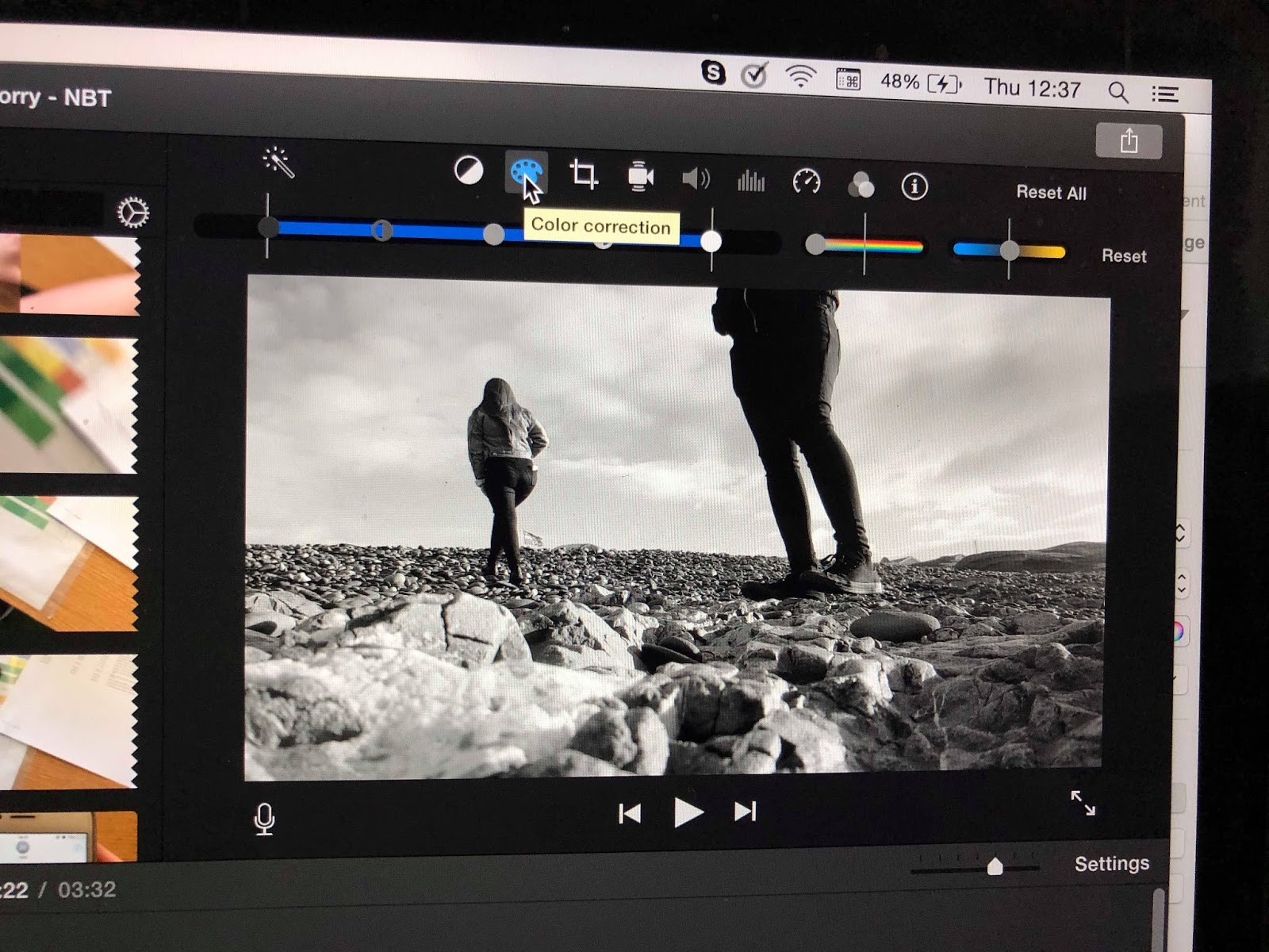
 When using iMovie, we were unable to use techniques such as isolating colour within a shot, as the software was not capable of advanced techniques such as this. Instead, we used a split between a black and white filter on shots, and standard colour on the rest of the shots, to demonstrate the protagonists transition between self-conflict, sadness and isolation, to happiness and acceptance of her sexuality. To create the black and white filter effect, we used the colour correction tool to erase the colour and leave the shot in black and white.


Throughout the video, we used the slow motion technique on a multitude of occasions. We felt that slowing down the clips to 80% of their normal speed helped to make them more poignant, and added to the emotion of the shots. In coloured part of the piece, we used slow motion as a method to make the shots seem very dream-like, as we wanted to represent the protagonists relief and intense happiness that she had finally accepted herself, and was falling in love again.
In our piece we featured sections of footage where we used cross dissolves. This was a technique we were unfamiliar with before this project, but we thought that using cross dissolve techniques worked almost like time lapse in a certain sense. We used a cross dissolve of Hannah and Josh walking on top of the rocks to represent sadness and how time moved slowly because the protagonist was so unhappy. We also used a cross dissolve in the reversed shot of Hannah walking on the pebbles away from Josh, to demonstrate the speed of her return to him, as she could not bring herself to let go.

We used the stabilisation tool on this long shot of Jade and Hannah at the beach, as due to the strong wind that day, the footage was a little shaky. The stabilisation tool proved to be quite effective, as it zoomed in on the shot more to decrease its shaky appearance.
Opinion on using iMovie...
I believe that switching to using iMovie was the best decision we could have made for our the editing process of our video. Our familiarity with the simple software allowed us to edit the footage a lot better than we would have using 'Adobe Premier Pro'. We could make full use of the software and its features, and for that reason, I believe our final edit is of a much better standard than we would have been able to produce using the more complicated software.

Although our group had experience in using Adobe Premier Pro, we still found that it was very complicated to get to grips with. We had found that time that could have been spent editing was being spent trying to figure out how to use certain tools and effects. As a group, we found that iMovie was a much more simple piece of software to use. Hannah and I had previous experience in using the software, which meant that we were aware of most of the features it had to offer, and could use them effectively.
What tools/techniques did we use?

We used the crop to fill tool to turn this relatively long shot of Hannah and Jade into a medium shot, as we felt that this would be more effective in the piece. Making the shot more focused on the girls highlights their emotion, and removes the unnecessary background that was included.
 When using iMovie, we were unable to use techniques such as isolating colour within a shot, as the software was not capable of advanced techniques such as this. Instead, we used a split between a black and white filter on shots, and standard colour on the rest of the shots, to demonstrate the protagonists transition between self-conflict, sadness and isolation, to happiness and acceptance of her sexuality. To create the black and white filter effect, we used the colour correction tool to erase the colour and leave the shot in black and white.

Throughout the video, we used the slow motion technique on a multitude of occasions. We felt that slowing down the clips to 80% of their normal speed helped to make them more poignant, and added to the emotion of the shots. In coloured part of the piece, we used slow motion as a method to make the shots seem very dream-like, as we wanted to represent the protagonists relief and intense happiness that she had finally accepted herself, and was falling in love again.
 |
| Cross dissolve with slow motion |
 |
| Cross dissolve with increased speed |
In our piece we featured sections of footage where we used cross dissolves. This was a technique we were unfamiliar with before this project, but we thought that using cross dissolve techniques worked almost like time lapse in a certain sense. We used a cross dissolve of Hannah and Josh walking on top of the rocks to represent sadness and how time moved slowly because the protagonist was so unhappy. We also used a cross dissolve in the reversed shot of Hannah walking on the pebbles away from Josh, to demonstrate the speed of her return to him, as she could not bring herself to let go.

We used the stabilisation tool on this long shot of Jade and Hannah at the beach, as due to the strong wind that day, the footage was a little shaky. The stabilisation tool proved to be quite effective, as it zoomed in on the shot more to decrease its shaky appearance.
Opinion on using iMovie...
I believe that switching to using iMovie was the best decision we could have made for our the editing process of our video. Our familiarity with the simple software allowed us to edit the footage a lot better than we would have using 'Adobe Premier Pro'. We could make full use of the software and its features, and for that reason, I believe our final edit is of a much better standard than we would have been able to produce using the more complicated software.
Subscribe to:
Comments (Atom)